
I decided to follow my inner yearnings and to dive, even deeper, into the waters of color (waterColor), and to continue to develop the same shapes/imagery by trying on new composition' arrangements ~ 'let's see what happens?' - attitude that would keep me more grounded in going deeper instead of, the usual, 'What could be a new technique that I haven't tried yet?' As expected, my 'boredom alert' kept on 'reminding' me, often not very gently, that the 'creative courage' is found in the mystery of new-ness, in taking more risks instead of less. And it finally hit me, I realized that my definition of 'creative courage' and its 'trail~blazing' qualities needs a dash of 'specific clarity' ingredient to work for me ~ so that I'm able to embrace the unknown not only by exploring its Depth, but also enchanting the wonders of its Breadth. Long story ~ very short, I kept on asking the same question, 'what if...?' ~ but this time I applied it to my exploration of variety through embracing the 'sameness' of elements... Unbeknown st to me, I may be in the process of creating a series of water color paintings ~ we'll see...
The funny thing is.... I've been priding myself of fearlessness and creative courage and initiative when it comes to experimenting with new techniques, mediums and strata, but perhaps that, so called, 'pride' ~ usually a blinding sense of hidden grandiosity, is the guilty suspect of my mistaken definition of 'creative courage'...??? And it is not about a 'right' or 'wrong' definition, as that is a very personal and intimate decision to embrace, but instead, it could be seen as a Creative Personal Coach, one that knows which of our atrophying creative muscle groups is in a desperate need of a workout... Perhaps, just like myself, you can relate to this metaphor ~ I have been staying clear of repetition in my art work to the point of wondering to myself if anyone has ever invented a vaccine for artistic boredom. Finally I've realized that there's an area in my creative self-expression that requires a heavy application of courage, of staying open to the unknown in the middle of utilizing the same elements of design to a new painting and it may just be a new opportunity for my growth. So, here I am.... waiting~out my insistence on 'new~ness' in my paintings, listening to the, often repeated rhetorical questions, 'do I REALLY feel like inventing the wheel...?' ~ I don't know, but adding more indignation to that sorry inner rhetoric by using, none other, than mostly round shapes of different lids, makes me laugh and adds a bit of determination in sticking up with my new found discipline ~ 'waiting out the usual b.s.' until a new painting is complete.

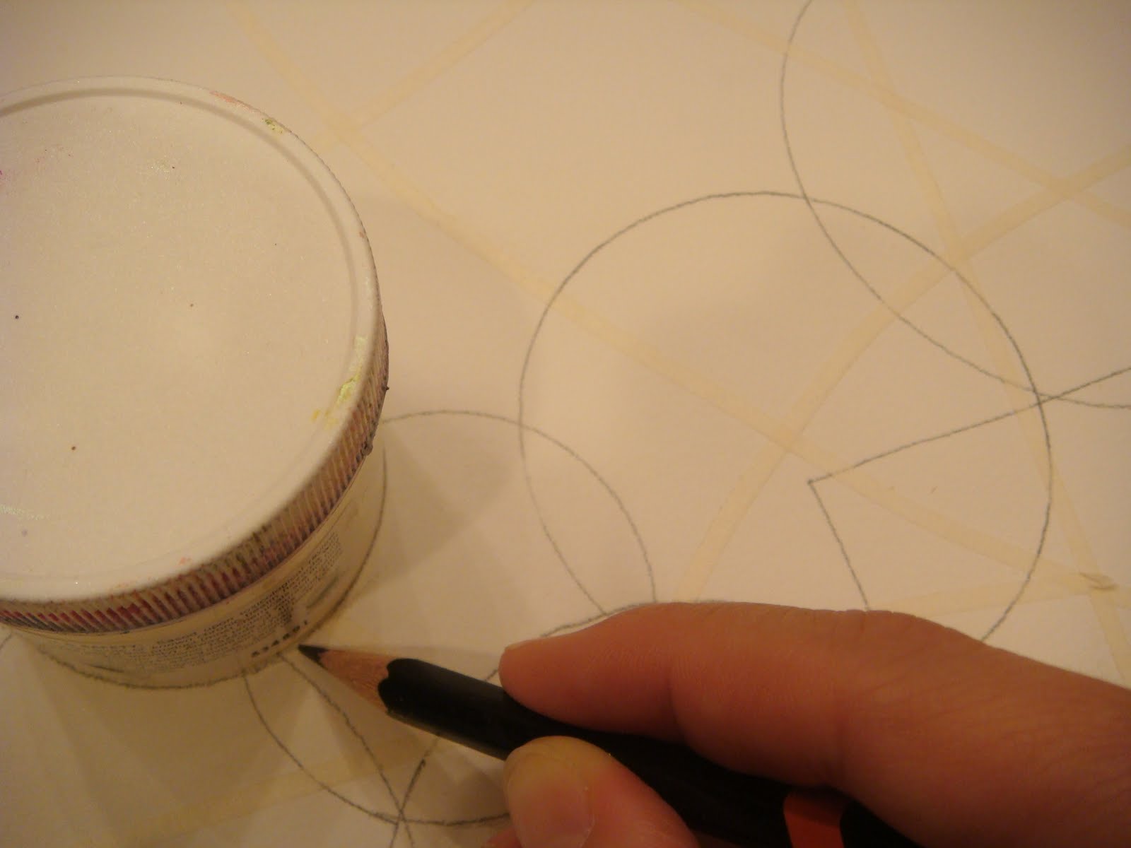
So, here's the scoop of the photos... begining with the above, I continued to work on the composition from the previous post ~ tracing numerous round lids and throwing in few square shapes just to aggravate the loud voices of my inner protest.... 'what 't heck, let's square the circles here and there and see if I can actually finish my painting while keeping my sanity at the same time....?'

If you remember from my last post, I first used a very thin masking tape (1/8'' wide) as an initial element of my background, which in the end became a permanent part of the composition by adding an additional curvature and optical separation.

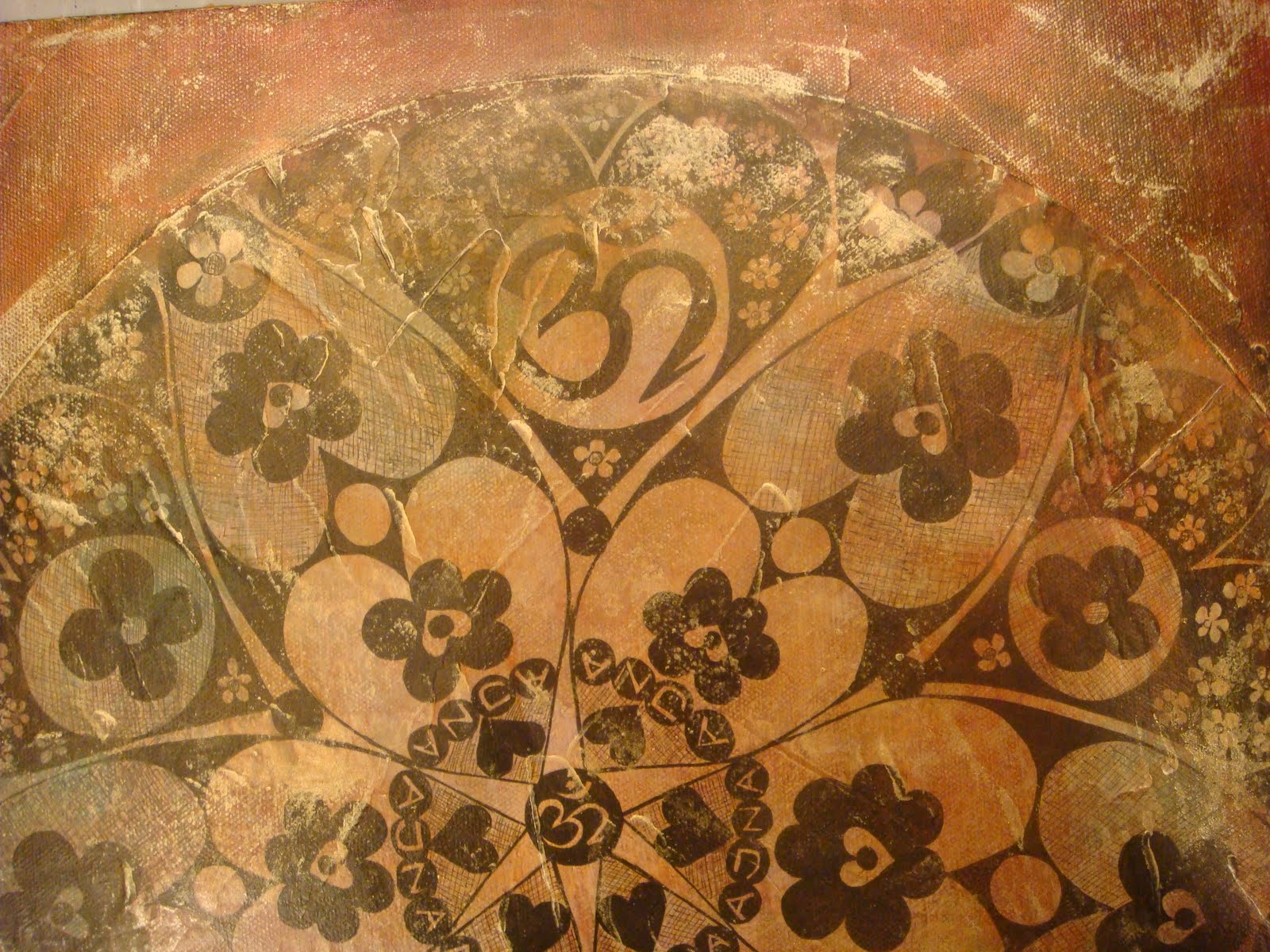
Someone commented on this photo by saying that it looks as though I photographed pieces of color glass stuck one on top of another... well, I didn't and I certainly did not plan on such effect, this painting felt like a natural 'extension' of my explorations of the main painting from my last post 'Autumn Flower' ~ exploring the geometry and shape relation to the exclusion of stamping and hand-drawn elements.
Next, I set out to go back and combine both, the geometric shapes and the 'organic' hand-drawn imagery from my first painting while ,with all my might, I struggled to expect the un~expected to come to life. As an alteration I employed two pieces of brown paper bag which I attached to the water color paper background with a double-sided sticky tape.

Next, I hand drew few flower~y shapes with a white charcoal pencil.

Above, I tried to 'tie together' both of the background materials and imagery by tracing round and square shapes with a black color pencil.

This is a finish background design right before a water color application.

After completing a heavy background wash with water colors, I used a Golden Acrylics Spray Varnish w/UVLS (Satin) to seal off the initial layers.

Once the varnish had set, I glued a piece of an old dictionary's entry with a Golden Acrylics Soft Gel (Semi Gloss) and upon drying, I proceeded to draw few petal shapes with a black water proof fine marker.

Sorry, I didn't photograph my meanderings in applying a multitude of acrylics colors to my painting.... the above is a finished work, 11x14 mixed media on paper, still awaiting its naming...
Soon, I gave into the temptation of 'variety' by settling on experimenting with a larger painting size, 18x24, yet still staying loyal to my circles... this time my cooking pots' lids were called to audition for a leading role in my emerging composition...


I first traced the shapes with a HB pencil and, later on, I went over them with a black color pencil in order to make sure that the outlines will survive the colorful 'flood' of watered~down pigment (H2OcolorS).

In my background development I used a mixture of different green values ranging from Green Gold to Sap Green and Phthalo Green in between, while sparsely leaving Cadmium Yellow and Zinc White deposits in the selected areas ~ making sure there's a distinct value range left behind...

.... you can see the dried background that also has experienced some heavy 'dabbing' off the wet paint with Kleenex

I begun my color exploration journey by first filling in the larger shapes with colors from the same family... bits of warm Yellow contrasting the underlying greens & light blues...

Next, I thought that after being such a 'disciplined disciple' of creative courage I deserve a treat.... how about a compliment.... why not complimenting myself with a complement(ary) color(s)... reds & pinks which will bring back the oranges and violets and then.... then... who knows who else will join the party...?

This is an up~to~the~moment shot of my painting... I can see some fine marker shape tracingS in its immediate future, followed by a generous coat of Golden Acrylics Spray Varnish w/UVLS (Satin)
What are your fun adventures and 'tough lessons' in embracing the 'variety of sameness'... be it through color, material, mediums, or the elements of design....?


