
Historically January & February are marked by a deep introspection and a somewhat dormant extroversion in my life... hence my 'cyber absence'.... In the beginning of February I had to prepare almost all of my artwork for a solo exhibit which will conclude in a week. At that time I did a lot of framing of the pieces which up until then had been basking in a frame~less glory around my house. One thing I learned from my framing experience ~ (mostly installing open~back frames) ~ that the creative development came to a completion for the majority of my artwork, only after a long process of selecting a 'perfect mate' for every single painting and collage.... in the end the final transformation took place... and, to much of my delight, I re~discovered some of my pieces anew....
But let's talk about romancing the altered photographic images and introducing them to the ever more versatile mixed media, acrylics and waterColors... During the last six weeks I did a lot of experimentation with pushing the boundaries of stratum and mediums applied to the selection of B&W photos. As you will soon see, the majority of images are the same and that was a conscious choice on my part since the beginning.... I wanted to use the exact, same image and to discover how it comes to life, or becomes buried under the myriad of 'over~done', 'over~applied' mediums which I use with much abandon... I mostly worked with a standard full-page, letter-size images which I printed on an ink jet printer. Simplicity and ease of duplication was key for me from the perspective of an initial image preparation ~ in other words ~ my outcome was to be able to do a 'show & tell' of the process that could be repeated by anyone having an access to an ink jet printer and an image source. Then the rest, the most stimulating and fun part of the journey was left up to you, the artist....On a side note, I'd like to address a question that's often being posed regarding the difference between using an image editor software, such as Photoshop or Picasa, and altering a photograph 'by hand.' When it comes to the almost miraculous capabilities of Photoshop in image alteration, the output is always in a ready-to-frame form that could be admired for the technical skills and aesthetic qualities of its creator. However, if you're up for a bold, adventurous journey filled with not only visual delights, but also offering you much treasured tactile feast, unexpected texture development, spontaneous applications of paint and mediums that can result in a 'creative dead~end' and an eventual 'break~through' into a newly emerged layer that turns out to be 'just~the~thing' your photo has been anxiously awaiting for.... Perhaps, in the end, the question is ~ how would like to engage your visual image development process at the moment....? Is it by using your computer mouse? By playing with your paint brushes & palette knives....? or would you forge your very own path, a hybrid of the many techniques that's uniquely yours ~ just like your Creative Self....
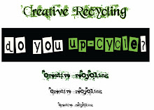
In order to prevent any unintentional injuries of your wrist due to excessive scrolling down;) I decided to limit the selection of images posted below.


(besides my subjective preference of B&W photos, I suggest for your own project to make sure that the image is sufficiently sharpened and that there's much shadows and light contrast ~ almost to the point of 'overdoing,' because during the printing your image will 'loose' a lot of contrast, especially if printed on a more adventurous background, ie. fabric, brown paper, acrylic skins).


In order to perform any physical manipulation with your printed image, it must first be safely preserved behind a layer of a varnish. I find that only a spray varnish will do the job right ~ it will eliminate the necessity of making any direct contact with the surface by using a brush, which will almost certainly result in an ink bleed. I like to apply a generous coat of Golden Archival Varnish with UVLs, either Satin or Matte.


I decided to permanently mount my altered photograph on a 11x14 canvas board using a gel medium as an adhesive. Next I 'framed' the image by applying a heavy, irregular layer of Golden Hard Molding Paste to the exposed canvas board. By choosing a flat angle brush as a tool, I was able to build a ridge~like texture with the paste.


Finally, a thick layer of Golden Liquid Acrylics Iridescent Silver (Fine) paid the closing credits to this altered photo.


As I said in the begining of this marathon post, in these two distinct alteration processes, the image itself stayed the same.... yet does it still feel the same to you?


Your creative nature always fascinates me, I love checking in to see what your doing. Just love this one !!
ReplyDeleteI'm very inspired by your compromising techniques and stretching limits to achieve great art. I used a hide glue to crackle furniture paint from the hardware store, took a long time to dry, but may be worth looking into. Nobody at hardware store knew that it was used to crackle paint as I believe it is for bonding leathers.
ReplyDelete