I have these six tomato plants sitting in my family room waiting to be finally planted and I think their number in line may be coming up later today. I hope.
Acute Overcommitment Syndrome ~ has been my new companion in life since late winter and I just can't part ways with it.... oh, the numerous techniques I tried to free myself form it ~ from
'letting go' to following a
'to-do list' daily, and my list seemed only to keep expanding exponentially right in front of my painful grimace of surprise!
So, both two of my current art works in-progress, practicing daily lessons from A Course in Miracles, and my Masters curriculum, and my business, and finally planting some perennials, and the six tomato plants, and making progress on my remodeling, and catching up with my articles' submission commitment..... I feel overwhelmed just typing those items from the very top of the list!
I have to write myself a public prescription here, a little Rx for regaining my battered sanity: "Change your focus from a 'large picture' view to a 'one-task-at-a-time'!" 'Mental zooming-in' is a practical lifesaver I've found refuge in numerous times in the past. If I won't narrow down my focus and continue to compulsively insist on having all those commitments crossed out from the to-do list simultaneously, someone else will be writing me prescriptions, and I mean, PRONTO!
Many popular books on time-management advice on the good, 'ol
delegating ~ sure, that would just be, well ....
groovy. I'd have someone study my curriculum, then write my thesis, and in the spare time that lucky individual, if still alive, will actually get to make art and write an article or two. And for an 'extra credit' I'll throw in keeping my blog up to date with daily posts! Hm, maybe I'm just wasting my valuable time here instead of writing a 'help wanted' ad for Craigslist???
Truth is ~ I don't want to delegate my life to anyone. It's my creation, and just like with my art making, I love it with much attachment. And perhaps the Real lesson, or task for me here, is to Allow myself to go at my own pace. On some days only 'walking' is possible (as the events of last weekend showed me clearly) and then there are times when 'sprint' feels effortless and fun and I can easily march an extra mile.... and herein lays the gift for my Self, bringing back the title and chorus of my favorite U2 song ~
Walk On.
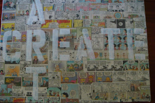
Few snapshots from my recent work, continued from the previous post.... both are 24x18 canvases

I'm using 5" letter stencils' templates to arrange 'Create Art'
 I applied a mixture of Golden Acrylic Glazing Liquid, Zinc White, and Iridescent Pearl to the openings of letters' templates.
For a better contrast I decided to paint over the letters with a diluted gesso. More to be created...

After that very heavy layer of Hard Molding Paste finaaaaaly completely dried I applied coat of gesso to the surface. That particular product, molding paste, has a semi-gloss, almost plastic texture that requires multiple layers of paint to finally hide its background. In the past I tried Acrylic Ground For Pastels ~ it yielded better results than just bare molding paste, but left a rough, paint-sucking skin, not to mention that it required an entire 8oz. jar of the product for a single application = $10.89! In this instance gesso is cheap, dries fast and it's a perfect ground for subsequent layers of paint and mediums.

Golden Permanent Violet Dark was used to cover the entire canvas, including all four sides.

Next, I wanted to experiment with Interference Violet (Fine), I applied a thin layer to the surface ~ it's difficult to see it in a photograph, but interference reflects back the metallic quality of color violet (in this example). As a product, it has a white-pearly sheen, but once you paint with it, especially against a darker surface, wow, its magic comes to life!

... a layer of Green Gold is greeting the canvas this time...

I painted selected areas of this piece with either Interference Violet, Interference Green, or Iridescent Pearl to bring forth all design elements.
 Remember Self-Leveling Clear Gel? That's the one, let's pour this baby mixed with a tiny bit of Interference Oxide Red, shall we?

Cobalt Teal has been 'shouting' to be included in the process at this point. I dug up a palette knife and granted the wish.... I can't wait to see what will happen next to this cornucopia of color and texture....
 Back in March I applied an oval-shaped layer of Crackle Paste to a canvas board....
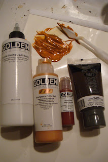 Next, I lined up and prepared a mixture of Acrylic Glaze (Satin) containing Interference Red Oxide, Quinacridone/ Nickel Azo Gold, and Raw Umber....
 I applied a thined-down layer of Golden Cobalt Teal to the canvas by using a palette knife.
 I indulged myself with more smaller and larger lid impressions against the surface. I used over a dozen random paint colors and make numerous impressions of varied colors one on top of another.
  Here comes the Resist - I dripped Clear Tar Gel off my palette knife all over the surface and let it dry.
 Here's a close-up of the brush strokes, I tried to wipe the excess paint in order to bring the Resist areas to the font. You can notice the irregular shapes of the initial application of Clear Tar Gel to the top right of the brush, gently covered by tiny layers of color.
 '150 N. Vintage Ave.'


 I thought more water-diluted gesso applied sporadically with a make-up sponge wedge in selected areas may be what the piece needed at the moment.
 .... where, oh, where is my self-leveling gel???? You... (SLG).... complete me....
 A helping of frosting, anyone???